Wednesday, 20 January 2016

Evaluation question 4) How did you use your media technologies in the construction and research, planning and evaluation stages?

How did you use your media technologies in the construction and research, planning and evaluation stages?


 From this slideshare I talk about the different ways in which I used media technologies for all of my finished products through each different stage. I think I was very dependent on technology, especially for my short film. Furthermore for my film poster and review page I was dependent on the programme softwares such as pixlr and pic monkey, even if it was something little like cropping something out, to something extreme like having to change a colour correction of a tiny specific bit of a picture. If it wasn't these technologies I don't think any of my final finished products would look anything like they do. I think a lot of technology and editing in short films is ok as it is a small audience and there isn't really a purpose to them however I think in mainstream feature films too much editing and special effects takes away the whole excitement of seeing the movie. I thin it works in some films however it can be overided and loose the point of the film however sadly I do think technology is only improving and therefore is the future.


Evaluation question 3) What have you learnt from your audience feedback?

What have you learnt from your audience feedback?


Questionnaire about short film – ‘STALKER’


1)      What did you like about the film?


2)      What did you think could be improved about the film?


3)      On a scale to 1-10, 1 being not good and 10 being excellent what would you rate it?


 4)      Did you understand clearly what genre it was?


5)      Do you think it suits the target audience?


This is another way I got some audience feedback I done a mini interview with one of my target audience members. I asked them the same questions from the questionnaire and then had a look at the feedback.


Here is my prezi that I made which answers the questions feedback on my short film. From the criticisms I got I then went back and edited some of the things that was said. For example I added the transitions in so they ran more smoothly and by doing this also then covered the fact one of the actors was wearing shoes with buckles on.


There was also then feedback for my poster and film review page. I asked them questions such as;
 'what did you like about it?
'what do you think could improve about it?'
'Do you think this looks professional or not?'
Here is some of my feedback.


Anonymous 1)

" I think the film poster is really good I like the main image on the front I think It really clearly shows that it is the horror genre. I also think that the film review page layout with the columns is very professional and gives the information out clearly but it doesn't give too much information. The language used is suitable its telling you what happens in the film however keeps some surprises as well"

Anonymous 2)

" I think that the film review page is set out in a professional way. I think the colour scheme throughout the products are consistent with each other I think this is very important, also these colours link to the horror genre. I think he images used, the main ones as well as the little ones all fit together and make it look more in tact which I think is an important thing. The things that were spoke about in the review page, things like 'Brian De Palma' would really appeal to the target audience as these are well known, I think this is a good touch".


Monday, 18 January 2016

Evaluation question 1) In what ways does your media product use, develop or challange forms and conventions of real media products?

In what ways does your media product use, develop or challenge forms and conventions of real media products?


Here I have deconstructed my film poster and explained the different conventions I used and why. With my film poster I hardly challenged the conventions of the specific horror genre I followed them from real texts and included them in my own media products. I looked at existing horror film posters such as 'v for vendetta', 'housebound', the 'eye' and I began to look at different conventions that they used and why. I had to keep in mind my target audience so therefore anyone 15+ and ensure that the things I was including on the front are suitable for them. Within this poster I have been completely conventional, I have done this as I believe there is more of an audience for mainstream, conventional films rather than unique, niche audience films. I have also been completely conventional because it then means there is more existing films I can look at and compare my work to to get more ideas.

Here is my film review page that I have again deconstructed to identify the different conventions and forms of a horror film review page. Again with this one I haven't challenge the forms and conventions, I have followed them and used them. I looked at existing film review pages such as 'the empire','screen','new films','time out' and adapted different conventions from them. I looked at how the layout in the columns were done and how they structured the pages. I used this to them write my introduction, talk about the storyline, add in any spoilers, talk about the characters in the film. I developed the different forms and conventions, I made things like colour schemes, fonts used, columns used all suitable for my target audience as well. I ensured the type of language I was using and the words I was using my target audience would understand.


In this picture above I have print screened the 3 different characters in which were in my short film. I have done this as I wanted to show that I have followed real conventions of short films and I have followed and not challenged these. I found that because it was a short film one of the conventions that was common in all of them wasn't more than 5 characters so in my case I used 3 maximum characters including myself.

In these next 5 pictures I am showing print screens of my different locations in which I used. This is another real convention of real media texts, so existing short films I have looked at. As we had limited budget this also limited where we could film so I decided to use my school, use the green screen, use a local graveyard and use a random woods with a park in. I found even though these were limited they were still effective and I didn't challenge the forms and conventions of real media texts.

Another convention I followed was limited time and dialogue. The only dialogue I had n my short film was right at the beginning and then right at the end within my newsflashes. I ound this was then easier to add creepy sound to make it more effective. As it is a 'SHORT' film I kept it at a time of 2 minutes 50 seconds which was what we aimed to do, this is an obvious convention I am following hence the word 'short'.

In conclusion, in all 3 of my media products I haven't challenged any of the conventions or forms. I done this for several reasons but I think overall mainstream films are morehighl rated, more highly understood and therefore work better for people. My texts fufil theories such as the 'uses in gratifications' theory which is about how people use media for the gratification of their needs. It propounds that people chose what they want to see or read and the different media compete to satisfy each individuals needs. This relates as it is basically saying people prefer to go and watch a film, or read a review or see a film poster that they understand, that they don't have to think too far in to it and it is light and easy to get. This is why I believe following the conventions and the almost 'norms' of existing movies and posters works and will continue to work, because people know what to expect!


Wednesday, 9 December 2015

before and after film poster


This is my before and after final ancillary task film poster on the right. I decided to use a quote on the top line in a thin font as this font is the one that matches the beginning opening of my film. I then looked at some different film posters and seen that the majority of them had a quote with a star rating about the film, underneath would be where it was from, so on my film poster I used "the guardian". I also then decided to give it a slight blur so the mask would look more professional and as I had to add two oval shapes in to the eyes it made them look more natural and faded in. I used a red black and white scheme as I think bright positive colours aren't very suitable for my genre as a whole. I also added in a billing block in which I made on a website as I seen it on lots of posters and I thought it looked professional. The red colour I added in throughout can connote blood and death, which relates to my film. The name stalker I think links well with the rest of the film poster, the mask of the person is the stalker in the film but his identity is never revealed which gives it a sense of mystery in which we are trying to create from our film. You can also see in the corner I included the age restriction my film is.

Tuesday, 8 December 2015

existing films i have used


This blog post is showing the different film posters I took ideas from to make my own. The main one is the middle one called the babadook. I liked the quotes on either side of the main image so I decided to do this on mine. I also liked what the little film quotes said like "truly frightening" so I used these on mine. I also then used the stars underneath and added the star ratings of my film and then who the review was from. I also then needed to add in my age restriction so people could see what age it was, mine is a 15 which means you need to be 15 to watch it. I noticed on most of the film posters I looked at specifically in the horror genre they always have a main image in the centre of the poster, standing out this is mostly the main character in the film, or the killer. These images are also really zoomed in which is what I done with mine. I also noticed the colour scheme in most of the existing ones are red black and white, these are the colours I used in mine to connote different things. We got our inspiration from the mask from the original film "V for Vendetta" which is a killer horror film that we liked the look of the mask from (top right) as it was a bit more interesting than the original scream mask. We didn't want to copy the v FOR vendetta film poster completely so we used the lighting differently and had different fonts.


ancillary task progress


Here is a few pictures I print screened as I was building up my film poster. You can see I began to adapt the different things I got from existing magazine covers I changed it a lot, deciding things like if I should keep it blurred or clear which would be more affective. I also then changed around the different fonts and colour schemes I could find, I added in different things and then took things away like the text box at the bottom, whether it should be bigger, add more information. As I was making this I was researching existing posters, in which I will show in another blog post but also getting feedback from people around me and showing them it progressing.

Monday, 16 November 2015

feedback interview with target audience


 This is a video I done to get feedback from my target audience on how they thought my film was going. This is christel blanchard who is the target audience, 18 years old. We asked her what she liked about it, what she thought we needed to improve on and if she thought it was suitable for the target audience. The things she thought we could improve on was speeding things up, changing the order of things, from this we then reviewed our film again and adjusted these things and it looked a lot better. We found this excersise really important and helpful as it meant we could continue to improve our film finding out exactly what our real life target audience thought. I am glad some of the things that was said in this film, the positive things as it meant I could reassure myself the film in general made sense because I had watched it so many times!! also we gathered a few more ideas we could possibly add like adding a twist on to it that the news reporter was actually the killer and by doing our film so early it means we have a lot of time to add if needed as our film at the minute is only 3:30 seconds long so we do have time and room for improvement and criticism.

Wednesday, 11 November 2015

intertextuality


Within my film there are a lot of references to previous existing horror films like slasher, we used a split screen in which we were inspired by the 1976 film 'Carrie'. We liked this as we thought it gave it an extra traditional twist, a thing you see a lot in horror films. We edited this on through the MAC using final cut pro and we also added a hazy affect on to it. The music that we used resembles 99% of horror films, its a mix of 'tiptoe in the tulips' and a innocent lullaby sound in which contrasted together to come across as an unnerving sweet tune. The fact that in our horror film we use a mask that is already in a thriller film, V for vendetta shows we have took inspiration from existing films I liked the creepy mysterious mask from that film and thought it would look better than the ultimate original scream mask. overall horror films are obviously influenced by films such as psycho, Halloween etc. 


Castings

Another person that auditioned was Christel Blanchard, who auditioned for the role of the killer/stalker. We liked how in character christel would be even though she had a mask on which was what we needed. She had a lot of enthusiasm which we liked and seemed passionate towards the role so we gave it to her. We were excited to start filming with her.
She also auditioned for the role of the news reporter however she was suited to the stalker/killer character rather than the news reporter as she wasn't great at remembering a log script.


The first person that auditioned for the role of the stalker/killer was charlotte bowers. However after the audition we didn't feel like she was suitable for the role as she was very shy and not very confident. Also we needed the stalker to have an aggressive manor about them and she seemed too sweet and kind about it so we didn't give her the role.
This is one of our casting members, her name is Jessica bates and she is applying for the role of the teenage girl that is being stalked. We needed someone quite young and just to look like your average teenage girl like jess does. We liked her because she would get in to character and take it seriously and really fulfil the role. Jessica also applied for the role of the killer/stalker however we decided that se would be more suited for the role of the teenage girl as we needed someone a bit taller and broader to do it so the mask would stay on.

Wednesday, 14 October 2015

Short film analysis


Exsisting films - analysis


Here I done another analysis of an existing film I am going to take ideas from. This is the original first Halloween out, directed by John Carpenter. One of my favourite things about this opening is that it is all from the killers perspective, so we as the audience follow the killer round building up tension so we don't know what the killer is going to do. I am going to do this in my film and I am going to use a mask within my film. I will then add an effect on the mac which make it look like the audience are seeing the stalker from the stalkers point of view. I think this is effective and will make it look professional. Again I like the screeching sound that is used in this, it seems to be common in old horror films I think I will use a sound similar to this when I do sound for my film. I think the film is very dark at the beginning but this builds up tension, I will try and film mine when it is dark as possible to create a mystery, if not I will use filters and effects on the mac t make it look darker and scarier. 

Exsisting films - carrie


Here I have began to find conventions from previous famous directors and adapt things that I can use in my short film. Here is the original Carrie director is Brian De Palma. I decided to use this as an existing text because I like a few of the unusual techniques he uses that aren't really used anymore. Here are a few examples, I like the affect of the split screen idea to show two different things coming together or two different scenes. I will use this in my short film so I can show what the stalker is doing and what the girl he is stalking is doing. Along with copying that technique I am also going to include the red hazey filter that is used throughout the whole of this scene. I think this effect is clever and I think it can be used professionally to connote certain thing but also to be a bit unusual. I will use this affect on a close up of the killer/stalker face, when he has just killed the girl, I think this will work and we will really emphasise the red of the blood on the knife.

Previous directors


Here I have included a scene from the world famous Psycho created by Alfred Hitchcock. I have decided to use this as an existing text to look at as it is a well known horror world class film. The shower scene in particular the motion of the knife stabbing violently is something I am going to use in my short film, I think I will copy the length and size of the knife being used and the motion, just because its well known. I want my killer/stalker in my film to be as violent as they are in this film because I think that is one of the conventions that makes it a classic scary horror. The loud screeching noise in the back ground, along with the screaming I think is a good way of showing what Is happening, I might use a particular noise every time my stalker appears because then I think the audience will understand the storyline better. The dripping of the blood I found effective and im going to use fake blood on the knife in my film.


Monday, 12 October 2015

script final draft

News report - opening

Good morning and welcome to channel 5 news. Our top story today is all about the one year death anniversary of Jessica green. This poor young girl was violently murdered by what we believe to be a duo kill.
She was brutally stabbed 3 times in her neck and 7 times on her torso. She was left in a pool of her own blood to die a slow, painful death.
This is still an ongoing investigation involving the local police and crime team. Forensics have found traces of Jessica's DNA in the local area, however not enough evidence to piece together a full story. There has been rumours however that Jessica was being stalked up until her death.
The criminals who did this are still out there so we urge all parents and children to have a safe but happy Halloween and if anyone knows anything please contact the hotline that will be on screen in a second.
Thank you and goodbye!


news report - emergency newsflash

We are interrupting programmes to tell you there has been another tragic death. The victim identified is a 13 year old girl named Angie White.
It has been said she has been stabbed several times in her neck and around her torso area, because of this MO we believe it was linked to Jessica's death a year ago today.
Once again if anyone knows or suspects anything ring our hotline which will be on screen in a second.


carol clover - final girl theory

This final girl theory was create by a woman named Carol Clover. The final girl is a trope in thriller and horror films, particularly slasher films. It refers to the last woman alive to confront the killer, ostensibly the one left to tell the story. The final girl has been observed in a lot of films such as alien, Halloween, a nightmare on elm street and Friday the 13th.
The term was coined by Carol clover in her book men, women and chainsaws: gender in modern horror film. She suggested in these films the viewer began by sharing the perspective of the killer, but experienced a shift in identification to the final girl partway through the film.
An example of this is as follows. Buffy Summers, the protagonist of the buffy vampire slayer, the TV series, was deliberately designed by the creator Joss Whedon as an alternative to the 'final girl' cliché. Buffy is subverting the final girl trope of horror films. Jason Middleton observes that although buffy for fills the monster killing role of the final girl, she is the opposite of Carol Clovers descriptions of a final girl in maydays. Buffy is a cheerleader, a beautiful blonde with a feminine first name and get the have sex with the boys and still kill the monster. I think with examples like this it can really support or undermine carols theory.

With my horror film, I think it is too risky to try and undermine any of the theories so I am going to go with what I think people will enjoy and understand. In my horror film the poor young girl does get killed and the killer does win, like we would expect in a normal horror film I just don't think the final girl theory would work for my short film.


wiy

Wednesday, 7 October 2015

reece - filming locaton 1


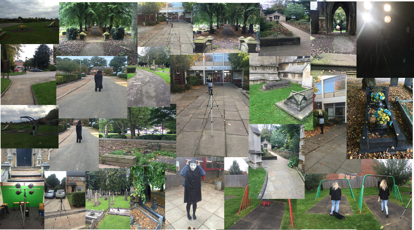
here is a recce of out first filming location. There are also a few pictures showing the props and us in action when filming. This scene was supposed to look like a normal housing estate where the stalker is following a young girls everyday move. There are a few up close shots you can see, I think I am going to use these and put quick flash effects on them to make the audience jump at the end. There is a few collaged pictures of where we were filming, for example the school, a normal street. We set up the tripod in the different locations so we could film accurately.


Monday, 5 October 2015

synopsis

synopsis...
this is the first synopsis I wrote, because of filming we had to change this.

my film begins with a mid shot of me reading out a news report, with the green screen behind me with a news reporter back ground, and then me being projected onto an old fashioned TV. the camera then zooms in onto me reading a news report about a missing child anniversary one year today. In the news report I will mention that it is Halloween, to make the audience aware, also explain how the killer of the young boy is still out there and may strike again. There is then a graveyard mid shot of a grave, this will quick flash to the different graves, and then a quick shot of the killer (jess) with a mask on. Then there will be a cut to a happy, fun Halloween party, there will be banners, sweets, kids, food, games etc., showing everyone having a good time. The next scene is cut to a dark scary woods, where the killer is around in the mask, scampering off behind trees and being creepy, this Is the killer who killed the young boy a year ago today on Halloween, and he's out to do the same this year. After cutting back to the news report saying 'be careful this Halloween, he is still out there' there is a cut to the killers black gloves knocking on the door of the party, the film will end there.


Here is the updated version of my synopsis..
My film begins with a news report, this is done with a green screen and a news report background is put in as the background. The news report is talking about a one year anniversary of a little girl who died and the murder is still a mystery, the news report urges anyone to get in contact so they can find the killer, in which they believe there are two of them, that stalked the young girl so they knew her everyday life.There is then a series of shots of a young girl doing day to day activities, walking home, walking in to school, but in the corner, secretly hiding/watching is one of the killers that the girl is completely unaware of. These shots are shown through a shot that is called 'mask', hence why there is a black circle around the shots, as the other killer is watching her too. The last shot you see of the young girl is walking into her house... The next shot is one of the killers knocking on the door of the young girl with a knife. There is then a flash back to the news report but this time it is an emergency announcement, that another little girl has been killed and it is the same MO as the young girl a year a go today. The next shot is the killer leaving the house with a bloody knife, laughing. The last shot cuts to the killer stood over the young girls grave he has killed, creepily staring...