Wednesday, 20 January 2016

Evaluation question 4) How did you use your media technologies in the construction and research, planning and evaluation stages?

How did you use your media technologies in the construction and research, planning and evaluation stages?


 From this slideshare I talk about the different ways in which I used media technologies for all of my finished products through each different stage. I think I was very dependent on technology, especially for my short film. Furthermore for my film poster and review page I was dependent on the programme softwares such as pixlr and pic monkey, even if it was something little like cropping something out, to something extreme like having to change a colour correction of a tiny specific bit of a picture. If it wasn't these technologies I don't think any of my final finished products would look anything like they do. I think a lot of technology and editing in short films is ok as it is a small audience and there isn't really a purpose to them however I think in mainstream feature films too much editing and special effects takes away the whole excitement of seeing the movie. I thin it works in some films however it can be overided and loose the point of the film however sadly I do think technology is only improving and therefore is the future.


Evaluation question 3) What have you learnt from your audience feedback?

What have you learnt from your audience feedback?


Questionnaire about short film – ‘STALKER’


1)      What did you like about the film?


2)      What did you think could be improved about the film?


3)      On a scale to 1-10, 1 being not good and 10 being excellent what would you rate it?


 4)      Did you understand clearly what genre it was?


5)      Do you think it suits the target audience?


This is another way I got some audience feedback I done a mini interview with one of my target audience members. I asked them the same questions from the questionnaire and then had a look at the feedback.


Here is my prezi that I made which answers the questions feedback on my short film. From the criticisms I got I then went back and edited some of the things that was said. For example I added the transitions in so they ran more smoothly and by doing this also then covered the fact one of the actors was wearing shoes with buckles on.


There was also then feedback for my poster and film review page. I asked them questions such as;
 'what did you like about it?
'what do you think could improve about it?'
'Do you think this looks professional or not?'
Here is some of my feedback.


Anonymous 1)

" I think the film poster is really good I like the main image on the front I think It really clearly shows that it is the horror genre. I also think that the film review page layout with the columns is very professional and gives the information out clearly but it doesn't give too much information. The language used is suitable its telling you what happens in the film however keeps some surprises as well"

Anonymous 2)

" I think that the film review page is set out in a professional way. I think the colour scheme throughout the products are consistent with each other I think this is very important, also these colours link to the horror genre. I think he images used, the main ones as well as the little ones all fit together and make it look more in tact which I think is an important thing. The things that were spoke about in the review page, things like 'Brian De Palma' would really appeal to the target audience as these are well known, I think this is a good touch".


Monday, 18 January 2016

Evaluation question 1) In what ways does your media product use, develop or challange forms and conventions of real media products?

In what ways does your media product use, develop or challenge forms and conventions of real media products?


Here I have deconstructed my film poster and explained the different conventions I used and why. With my film poster I hardly challenged the conventions of the specific horror genre I followed them from real texts and included them in my own media products. I looked at existing horror film posters such as 'v for vendetta', 'housebound', the 'eye' and I began to look at different conventions that they used and why. I had to keep in mind my target audience so therefore anyone 15+ and ensure that the things I was including on the front are suitable for them. Within this poster I have been completely conventional, I have done this as I believe there is more of an audience for mainstream, conventional films rather than unique, niche audience films. I have also been completely conventional because it then means there is more existing films I can look at and compare my work to to get more ideas.

Here is my film review page that I have again deconstructed to identify the different conventions and forms of a horror film review page. Again with this one I haven't challenge the forms and conventions, I have followed them and used them. I looked at existing film review pages such as 'the empire','screen','new films','time out' and adapted different conventions from them. I looked at how the layout in the columns were done and how they structured the pages. I used this to them write my introduction, talk about the storyline, add in any spoilers, talk about the characters in the film. I developed the different forms and conventions, I made things like colour schemes, fonts used, columns used all suitable for my target audience as well. I ensured the type of language I was using and the words I was using my target audience would understand.


In this picture above I have print screened the 3 different characters in which were in my short film. I have done this as I wanted to show that I have followed real conventions of short films and I have followed and not challenged these. I found that because it was a short film one of the conventions that was common in all of them wasn't more than 5 characters so in my case I used 3 maximum characters including myself.

In these next 5 pictures I am showing print screens of my different locations in which I used. This is another real convention of real media texts, so existing short films I have looked at. As we had limited budget this also limited where we could film so I decided to use my school, use the green screen, use a local graveyard and use a random woods with a park in. I found even though these were limited they were still effective and I didn't challenge the forms and conventions of real media texts.

Another convention I followed was limited time and dialogue. The only dialogue I had n my short film was right at the beginning and then right at the end within my newsflashes. I ound this was then easier to add creepy sound to make it more effective. As it is a 'SHORT' film I kept it at a time of 2 minutes 50 seconds which was what we aimed to do, this is an obvious convention I am following hence the word 'short'.

In conclusion, in all 3 of my media products I haven't challenged any of the conventions or forms. I done this for several reasons but I think overall mainstream films are morehighl rated, more highly understood and therefore work better for people. My texts fufil theories such as the 'uses in gratifications' theory which is about how people use media for the gratification of their needs. It propounds that people chose what they want to see or read and the different media compete to satisfy each individuals needs. This relates as it is basically saying people prefer to go and watch a film, or read a review or see a film poster that they understand, that they don't have to think too far in to it and it is light and easy to get. This is why I believe following the conventions and the almost 'norms' of existing movies and posters works and will continue to work, because people know what to expect!


Wednesday, 9 December 2015

before and after film poster


This is my before and after final ancillary task film poster on the right. I decided to use a quote on the top line in a thin font as this font is the one that matches the beginning opening of my film. I then looked at some different film posters and seen that the majority of them had a quote with a star rating about the film, underneath would be where it was from, so on my film poster I used "the guardian". I also then decided to give it a slight blur so the mask would look more professional and as I had to add two oval shapes in to the eyes it made them look more natural and faded in. I used a red black and white scheme as I think bright positive colours aren't very suitable for my genre as a whole. I also added in a billing block in which I made on a website as I seen it on lots of posters and I thought it looked professional. The red colour I added in throughout can connote blood and death, which relates to my film. The name stalker I think links well with the rest of the film poster, the mask of the person is the stalker in the film but his identity is never revealed which gives it a sense of mystery in which we are trying to create from our film. You can also see in the corner I included the age restriction my film is.

Tuesday, 8 December 2015

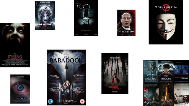
existing films i have used


This blog post is showing the different film posters I took ideas from to make my own. The main one is the middle one called the babadook. I liked the quotes on either side of the main image so I decided to do this on mine. I also liked what the little film quotes said like "truly frightening" so I used these on mine. I also then used the stars underneath and added the star ratings of my film and then who the review was from. I also then needed to add in my age restriction so people could see what age it was, mine is a 15 which means you need to be 15 to watch it. I noticed on most of the film posters I looked at specifically in the horror genre they always have a main image in the centre of the poster, standing out this is mostly the main character in the film, or the killer. These images are also really zoomed in which is what I done with mine. I also noticed the colour scheme in most of the existing ones are red black and white, these are the colours I used in mine to connote different things. We got our inspiration from the mask from the original film "V for Vendetta" which is a killer horror film that we liked the look of the mask from (top right) as it was a bit more interesting than the original scream mask. We didn't want to copy the v FOR vendetta film poster completely so we used the lighting differently and had different fonts.