Wednesday, 9 December 2015
before and after film poster
This is my before and after final ancillary task film poster on the right. I decided to use a quote on the top line in a thin font as this font is the one that matches the beginning opening of my film. I then looked at some different film posters and seen that the majority of them had a quote with a star rating about the film, underneath would be where it was from, so on my film poster I used "the guardian". I also then decided to give it a slight blur so the mask would look more professional and as I had to add two oval shapes in to the eyes it made them look more natural and faded in. I used a red black and white scheme as I think bright positive colours aren't very suitable for my genre as a whole. I also added in a billing block in which I made on a website as I seen it on lots of posters and I thought it looked professional. The red colour I added in throughout can connote blood and death, which relates to my film. The name stalker I think links well with the rest of the film poster, the mask of the person is the stalker in the film but his identity is never revealed which gives it a sense of mystery in which we are trying to create from our film. You can also see in the corner I included the age restriction my film is.
Tuesday, 8 December 2015
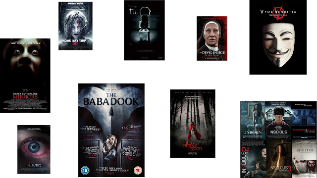
existing films i have used
This blog post is showing the different film posters I took ideas from to make my own. The main one is the middle one called the babadook. I liked the quotes on either side of the main image so I decided to do this on mine. I also liked what the little film quotes said like "truly frightening" so I used these on mine. I also then used the stars underneath and added the star ratings of my film and then who the review was from. I also then needed to add in my age restriction so people could see what age it was, mine is a 15 which means you need to be 15 to watch it. I noticed on most of the film posters I looked at specifically in the horror genre they always have a main image in the centre of the poster, standing out this is mostly the main character in the film, or the killer. These images are also really zoomed in which is what I done with mine. I also noticed the colour scheme in most of the existing ones are red black and white, these are the colours I used in mine to connote different things. We got our inspiration from the mask from the original film "V for Vendetta" which is a killer horror film that we liked the look of the mask from (top right) as it was a bit more interesting than the original scream mask. We didn't want to copy the v FOR vendetta film poster completely so we used the lighting differently and had different fonts.
ancillary task progress
Here is a few pictures I print screened as I was building up my film poster. You can see I began to adapt the different things I got from existing magazine covers I changed it a lot, deciding things like if I should keep it blurred or clear which would be more affective. I also then changed around the different fonts and colour schemes I could find, I added in different things and then took things away like the text box at the bottom, whether it should be bigger, add more information. As I was making this I was researching existing posters, in which I will show in another blog post but also getting feedback from people around me and showing them it progressing.
Subscribe to:
Comments (Atom)


